Oasis Dental

Dentistry, Science and Art
The approach
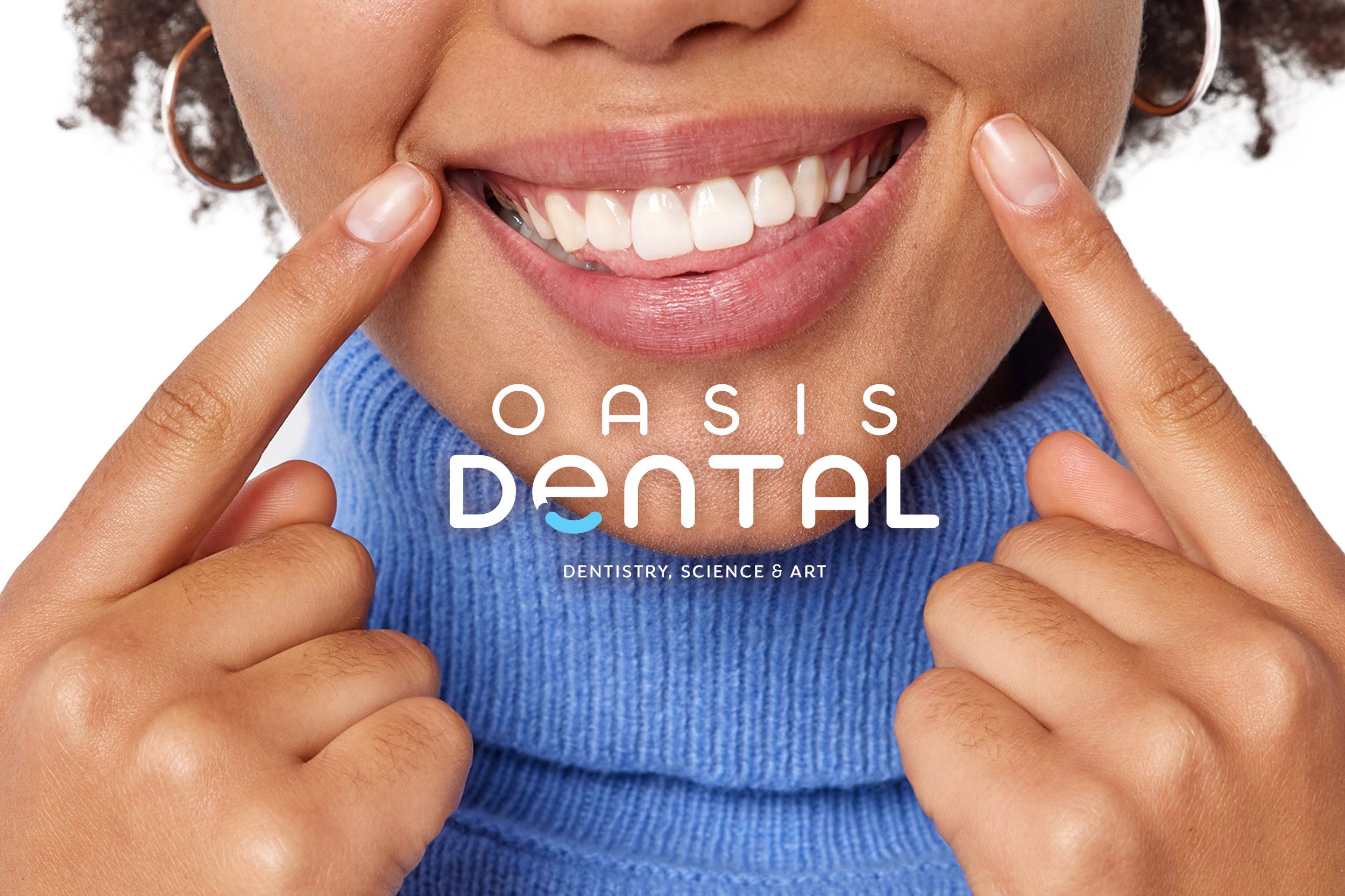
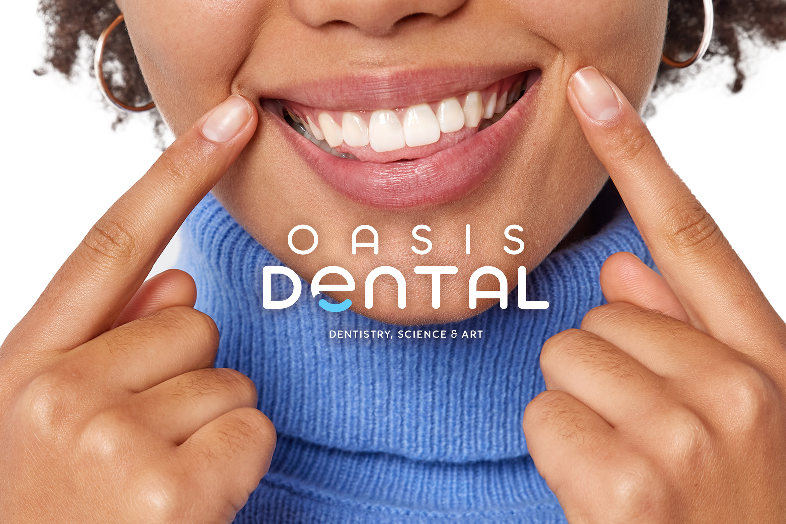
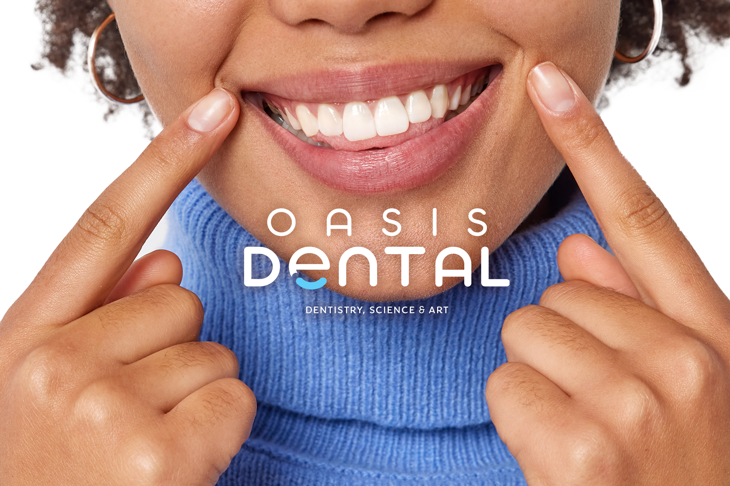
An approachable brand that balances clinical confidence with warmth. Bright colors, expressive photography, and clear typography create a welcoming visual language.
The identity
A smile-shaped detail within the wordmark adds a human touch. Deep blue anchors the identity, while aqua and yellow bring freshness and energy.
The applications
The identity extends across packaging, stationery, printed communications, and social content, creating a consistent experience at every touchpoint.
Scope
Visual identity · Packaging · Print collateral · Social design.

Municipal Water Monitoring
We redesigned an aging logistics hub, integrating autonomous robotics and IoT analytics to elevate throughput and reliability.